In a recent post, I introduced the concept of Lead Generation Websites as opposed to Brochure Sites. In this post I’m going to explore this concept in a more depth because I think it’s important to understand the difference if you genuinely want a website that will be you primary source of business leads.
The classical definition of a brochure website is one consisting of a few pages (typically up to 5) that contains information about the company, it’s products and services, and some contact information. In other words a brochure website is an online equivalent of a classical company paper brochure, albeit with additional capabilities, such as the ability to present video and audio in addition to text and images.
Small 1-3 page website used as an online brochure to convey information and display promotional material.
Source: http://www.canzdesign.com/info/Glossary
But brochure websites can have many more pages than this
My argument is that a website can have many more than 5 pages and still be a brochure site. I contend that it’s not the number of pages that defines a site as a brochure site rather than the content and structure. Indeed, I have developed websites with many more pages than this that I regard as being brochure sites. I’ve even got one with around 500 pages that I would still define as a brochure site.
To understand where I’m coming from, consider the classical company paper brochure; what does it traditionally contain? Most brochure have a page or two about the company, pages about the products and services, probably some testimonials, and some contact information, possibly even a tear off form already addressed and franked. Many brochures are not limited to 5 or 6 pages, some have many more than this. However the purpose is the same whatever the size; present information to potential customers and show them how to contact you.
Now compare this to a typical small business website. The structure of most of these is almost identical; Home page, About Us, Products and Services, Testimonials, Contact Us, and the purpose is exactly the same as a paper brochure; present information and show potential customers how to contact you. There is no process involved in this. It’s pretty much left up to the site visitor to decide whether to make the call or fill in the contact form.
Now contrast this with a genuine lead generation site.
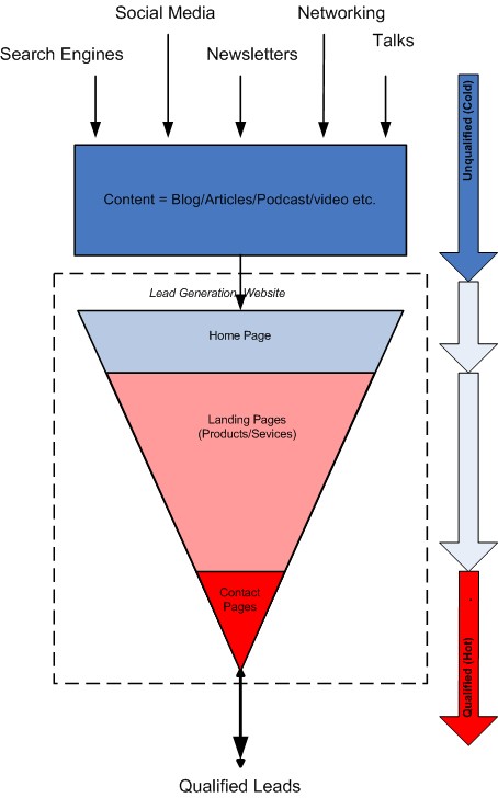
The sole purpose of a lead generation site is to convert visitors into leads. The site is carefully worded and structured so as to channel visitors through a “marketing funnel”, from Home page, through inner Landing pages, then ultimately to a Contact page. The aim of each stage in the funnel is to gradually increase the visitors’ confidence, or in marketing-speak gradually qualify the customer. A potential customer going though a well designed lead generation site would hardly realize that he/she was being steered though to the contact point.
What about getting visitors to the site?
As I said earlier, the purpose of a lead generation site is to convert visitors to leads rather than attract visitors per se. So how do we get visitors to the site? The following diagram illustrates the process.
The key to attracting visitors is content in the form of a blog or content library to which visitors can be directed. Blog posts and articles are written such that they will be found by potential visitors on search engines. Content can also be promoted on Social Media sites, through live networking events, seminars, and speaking engagements etc.
The blog works in conjunction with the website, represented by the funnel in the diagram. to convert those visitors to hot leads. by steering visitors to the site though judiciously placed links.
Note, in most lead generation sites, the blog and content is integrated into the site. However this doesn’t change the concept where the purpose of the part represented by the funnel is to convert visitors to leads. Understanding this is the key to building a true lead generating website.
Most small business websites are, in effect, brochure sites
This is because they don’t really embrace this concept of lead conversion and implement it correctly True, many of them have blogs and lots of content and some rank highly for relevant keywords, but they usually fall down in converting the visitors to leads. I think their are two reasons for this.
Firstly, designing and building an effective lead generation site takes a lot of work and expertise in both upfront design and ongoing tuning and modifying. It is, therefore, costly. However, bear in mind that this is an investment that can be repaid many times over.
Secondly, I don’t think that many web developers understand this concept and so don’t offer true lead generation sites.
Is your website lead generating?
Has your website been designed to be lead generating or is it simply a brochure site? I will leave you with this thought. In a future post, I will explain what it takes to make a website truly lead generating.


