Have you ever wondered how websites work? This is the first in a series of posts aimed at explaining what’s involved in designing, building, and running a website.
These posts are aimed at people who want to have a website developed. They want to understand the basics about the process so that they can talk with some knowledge to website designers and developers.
In this post I will describe the various parts of a website as you see it. The next post will explain those parts of the site that you don’t see – behind the scenes in other words. Subsequent posts will go into some of the components in more detail.
I’m going to start by assuming that you have a website open on your computer (PC, laptop, or smart phone). I shall explain how you got there in a later post.
The first impression you get when you first arrive at a website is down to the design and content.
Website Design
The website that you’re looking at has a design which comprises colours, layout, and structure. The purpose of the design is to make that site pleasing to look at and easy for the visitor to find information.
A good design alone is not enough to entice a visitor into investigating more pages of the site. Good, relevant content is needed to do that do that.
Content
Within that design you will find content. The content is what conveys information to the visitor. Content can take several forms.
Text
Text (sometimes referred to as web copy) is usually structured with multiple headings and bolding. Text font style, size and colour are all part of the overall design and can have a big impact on how easy visitors can read it – the readability.
How much text you need depends on the nature of the site and the business that it serves. For example, a site for a technology company would use text to describe it’s services. A site for a photographer would rely more on images to show its services to visitors.
Images
Images can convey just as much information to the visitor as text in some situations. But this is only the case when images are relevant to the topic covered by the web page that they reside in.
These days, images should be high-quality. Remember that images, whilst being part of the content, are also part of the design. A good design can be ruined by poor quality images.
The positioning of images on the page is also part of the design and serves to enhance the visitors’ understanding of the text
Video
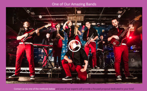
Video is sometimes included to further inform the visitor and is particularly useful for explaining things that are difficult to fully explain by text. The video shown below, for example, shows a particular performance from a band. In this context, the video is essential as text would be useless and images would not go far enough to demonstrate the capabilities of the band.
Often the videos themselves are embedded into the webpage from another website such as YouTube. The visitor sees the video within the webpage even though it is playing on the other website.
Forms
Most website include at least one form somewhere. The example below is a simple contact form that allows the visitor to his/her details in the various fields and then sent them to the website owner without leaving the web page.
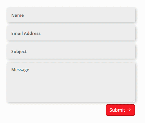 Forms can be much more complicated than this example. Survey forms or forms that gather visitor information are examples. The thing to remember about forms is that they require interaction from the visitor. The longer the form, then the more care needs to be taken in designing it to avoid confusing the person who fills it in.
Website Pages
Website pages that make up a website can take different styles.
Informational Pages
Informational pages describe details about a business. For example, they will describe topics such as; business overview, services, pricing, about the business, and how the business operates
Informational pages can contain any, some, or all of the content types that I described previously. The key thing is that they convey messages clearly and succinctly to the reader.
Informational pages can have a big impact on the positioning of the website in search engine rankings. Not just about the words used in the text but the overall relevance of the page. I shall cover this in more detail in a later post.
Blog Pages
A blog is a section of the website containing informational pages, or posts, which are typically written by the website owner as opposed to the website developer. Each post acts as a discrete, diary-style entry.
Blogs are usually updated frequently and contain news, opinions, and updates on various topics. They contain forms that allow visitors to feed comments back to the website owner and for the owner to post replies back, so creating a discussion.
Blogs allow the website, or business, owner to hold a dialogue with visitors which can greatly improve the effectiveness of a website.
eCommerce Pages
An eCommerce section, or online shop, is essential for businesses that want to sell online. Think of eCommerce and we all think of Amazon. But they are useful for selling much more than physical products.
Online shops can sell non-physical items such as services where nothing is actually delivered to the customers other than a receipt email confirming the customers sign-up to the service. Other examples of non-physical items include digital images, digital books or report.
eCommerce systems usually have a section that can be accessed exclusively by the website owner. Here, he or she can perform operations such as order management, stock control, catalogue updates. (Catalogue is the term used for the entire collection of pages describing the items being sold).
Payment Pages
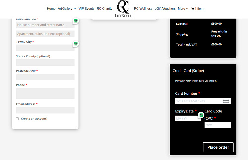
An eCommerce system usually has a payment facility which allows users to pay online with credit/debit cards and other payment methods such a PayPal and cheques
Payment systems for small and medium businesses normally use payment gateways. They interface between the website and the bank where payment will be sent. A key function of a payment gateway is to handle all the personal financial information about the customer, such a credit card details,
Payment gateways remove the liability for the customers’ data from the website owner. The takes away any requirement for the website to have to jump through complicated financial certification hoops.
User Account Pages
Many websites allow visitors to register and create accounts. This then gives them access to sections of the site that only they can log in and access.
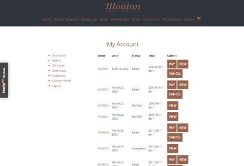
eCommerce systems allow visitors to create accounts and register their details. They can then, log in and, for example, view details such as orders placed, cancel orders, set receipts, change addresses and contact details,
The advantage of having an online account is that the customer’s details (addresses, phone number, email; etc.) will be automatically filled in when they want to order something.
Website Navigation
You move through, or navigate, the various pages of a website using links. Click a link and you move to the other page.
Good clear navigation is important for a website to be effective. The visitor should not have to spend time hunting for links – navigation is not a game. The visitor would be clear where he/she is at any point in the website.
Good navigation can also have an important role in search engine positioning.
On a typical website you will find links in two ways.
Menu Links
Most websites have some form of menu – a series of links indicating the main pages of the site.
These links can appear in a strip across the top of each web page or sometimes in a list down the left-hand side of the page. In some cases, both can appear.
On smart phone, menus usually take the form of hamburger menus – an icon comprising three small horizontal lines stacked one on top of the other.
Links embedded in text or images
Links can also be embedded in text and images so that the visitor can click the link and be taken to another part of the site, or even to another website.
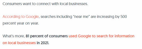
In text they are indicated by a change of text style – underlines in many cases – and the cursor will change to a hand when you hover over them. Embedded links are usually formatted to stand out from the rest of the text as in the above image. A different colour, underlining, or sometime italicizing are used.
Next
What I’ve just described should have given you an understanding of what you see on your screen when you view a website. The next post will describe the things that allow you to reach the site and the things that are happening behind the scenes to provide and maintain what you see.
Future posts in this series will cover topics such as blogs, eCommerce, Search Engine Optimization (SEO, and content marketing, in detail.

